Best Living Room Paint Colors: What Actually Makes a Room Feel Bigger (Not Just “Neutral”)
I have seen countless living rooms fall flat simply because the homeowner chose a bright, stark white paint, assuming it would instantly brighten a small, north-facing space. In reality, the most expensive-looking rooms rely on subtle undertones and light behavior rather than price tags to create depth and warmth.
And “safe” doesn’t always mean “bigger-feeling.” A dark, saturated wall can expand a small room in a way plain white never does — it just has to be the right dark color, applied the right way.
This guide covers exact color combinations, the finishes each one needs, and a process for testing paint so you get a high-end look without paying a designer.
Quick Answer
Deep, saturated colors — navy, forest green, terracotta — often make a small living room feel bigger than a pale neutral does, because they blur the edges of the room instead of highlighting them. Warm off-whites and greiges still work well when a room needs more brightness than mood. The right choice depends on how much natural light the room already gets, not on which option feels “safer.”
Key Takeaways
- Dark, saturated colors on all four walls (not just one accent wall) can make a small room feel larger by removing the visual edges where wall meets wall.
- Matte finishes look richer on dark colors but show fingerprints and scuffs faster — worth a trade-off you should decide on, not something to ignore.
- Test paint swatches on all four walls and check them in morning, afternoon, and evening light before buying gallons.
- Warm undertones (yellow, pink, beige) read as rich and inviting; cool undertones (blue, stark gray) can read as sterile in low light.
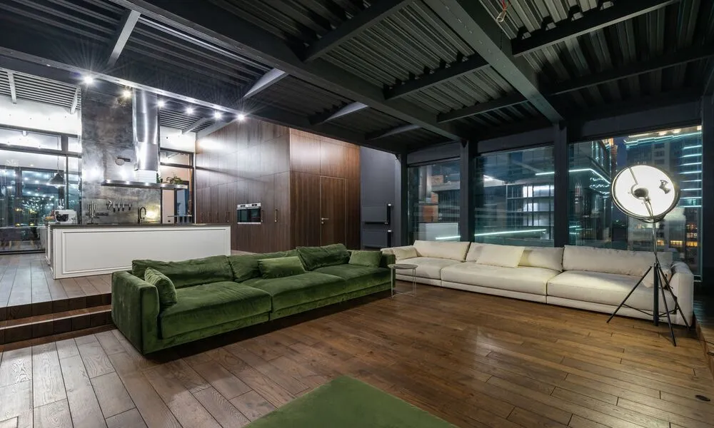
- Painting the ceiling the same shade as the walls — a technique called color drenching — removes the hard line where wall meets ceiling and visually raises the height of the room.
Bold Colors That Make a Small Room Feel Bigger
This is the part most budget guides skip, because dark paint sounds like the opposite of “making a room feel bigger.” It isn’t. A room painted one continuous dark color loses its corners — your eye can’t find the edges, so it stops measuring the space and just experiences it.
Deep Navy Blue
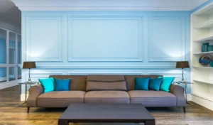
Navy forces the walls to recede instead of announcing themselves, which is why it works better in a small room than most people expect. It needs a matte finish — a matte navy in daylight reads as complex and moody; the same color in satin or gloss just bounces harsh reflections around and highlights every drywall imperfection.
Navy works best in rooms that already get limited natural light, leaning into a cozy, library-like feel rather than fighting for brightness it doesn’t have. A shade like Farrow & Ball’s Hague Blue shifts noticeably from day to night, which is part of what makes it feel expensive rather than flat.
If you go this route, keep the rug and seating light — cream, camel, pale gray — so the room doesn’t tip from “cozy” into “cave.”
Baked Terracotta
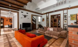
Terracotta gives a boxy, characterless living room instant personality — a sun-baked, Mediterranean feel that a beige version of the same room simply doesn’t have. Look for a shade built on brown and dusty orange rather than a shade that leans toward bright red; the undertone is what separates “warm and grounded” from “clashing.”
It’s particularly effective in north-facing rooms, where daylight tends to run cool and slightly blue. The warm pigment counteracts that chill instead of fighting it. Pair it with crisp white trim and organic materials — rattan, jute, linen — and it stops looking like a paint choice and starts looking like a design decision.
Muted Sage Green
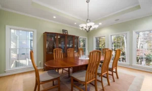
Sage is the closest thing to a bridge color between bold and neutral, but it earns its place here because it doesn’t require you to commit to full drama — you get color without the room screaming for attention. Choose a sage with a heavy gray undertone; too clean or bright and it starts reading as a nursery rather than a living room. A flat or matte finish emphasizes the organic, slightly dusty quality that makes this color work.
It performs especially well against wood floors or leather furniture, since it pulls warmth out of both. Skip a bright white ceiling here — a cream or pale beige ceiling softens the transition instead of creating a hard stop.
Dusty Blush Pink
Blush has shed its nursery reputation, but only in the right undertone. Look for a version labeled “plaster” or “setting sun” rather than a true pastel pink — the brown or gray underneath is what keeps it grounded and adult rather than sweet. It flatters skin tones in a way most colors don’t, which is part of why it works so well in a room where you actually entertain.
Treat it the way you’d treat beige: as a backdrop, not a theme. Pair it with brass accents or a dark, contrasting piece like a charcoal velvet sofa, and resist the urge to add more pastels around it — that’s the one thing that will tip it back into “little girl’s room” territory.
Neutral Foundations, When You Want Light Over Mood
None of this means neutrals are wrong — they’re just a different tool. If your living room already runs dark, or you genuinely want brightness over drama, these are the shades worth the money.
Warm White
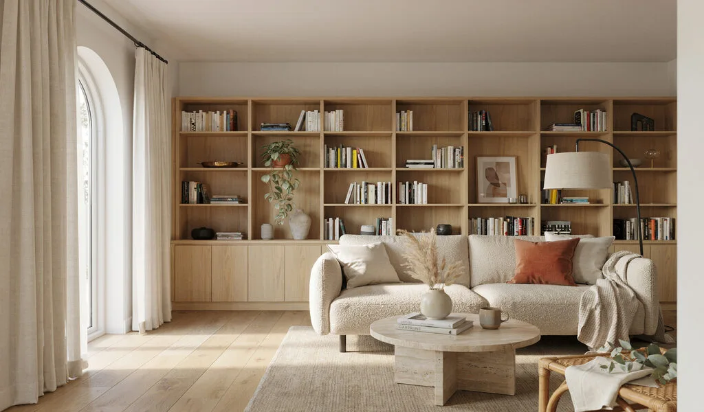
A warm white updates a dated room instantly and makes budget furniture look intentional rather than mismatched. The undertone is what matters here — look for a whisper of yellow or beige, not a stark, blue-leaning white, or the room can end up feeling closer to a waiting room than a living room. It performs best in south-facing rooms with real direct sun; in north-facing rooms it can turn slightly gray by afternoon. Sherwin-Williams Alabaster is a common choice for exactly this reason — it holds just enough creaminess to avoid looking cold.
Paint the trim the same warm white in a satin finish rather than switching to bright white trim — the subtle sheen difference reads as intentional, not like two different decisions.
Greige
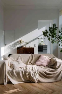
Greige sits between the warmth of beige and the edge of gray, and it’s genuinely useful in a living room that doesn’t have much architectural detail to lean on — it adds depth without adding busyness. Benjamin Moore’s Revere Pewter is a common pick specifically because it shifts: warmer under artificial light in the evening, cooler in daylight, so the room doesn’t feel flat at any hour.
Where greige earns its reputation is in layering — matching shades of greige and cream across curtains, rugs, and pillows builds a tonal look that reads as considered rather than simply “neutral because it was easy.”
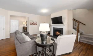
Soft Warm Gray
A cool gray can read icy; a warm gray — one with brown or taupe underneath — reads tailored instead. It works particularly well in south-facing rooms with modern furniture or metal accents, where it provides enough contrast against white trim to look deliberate rather than default.
Matte black hardware on doors, lamps, and curtain rods against this color creates a sharp, considered contrast that a plain gray-on-gray room usually lacks.
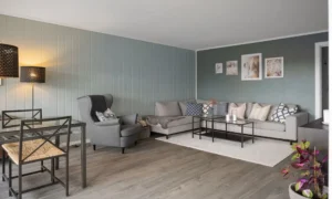
Beyond Flat Color: Two Techniques Worth Knowing
Faux Limewash
Real limewash and Venetian plaster are expensive and require specialist application. You can get a close approximation with ordinary wall paint and one extra ingredient: joint compound.
The working ratio most people land on is roughly one part joint compound (mixed with a little water to a pancake-batter consistency) to three parts paint, blended until smooth. Patch and sand any holes or seams first — the technique will highlight, not hide, existing wall damage. Apply with a dry block or masonry brush in loose, criss-crossing strokes rather than a roller; the unevenness is the point. Stick to earthy tones — clay, soft beige, pale olive — for the most convincing result, and expect to need two to three thin coats rather than one.
One honest caveat: this is a textured, matte finish, which means it isn’t especially washable. It suits a living room wall that doesn’t get touched much more than it suits a high-traffic hallway.

The Intentional Accent Wall
An accent wall works when it has an actual job to do — anchoring a fireplace, a built-in, or another architectural feature the eye already goes to. A wall picked simply because it’s “the one without furniture” usually reads as arbitrary rather than intentional.
A deep charcoal or forest green on that one wall creates real drama for the cost of a single quart, while the surrounding walls stay a soft warm white to keep the room from feeling boxed in. The one wall to avoid: anything with a window or the main entry door, since backlighting will make the color look muddy and undercuts the effect entirely.
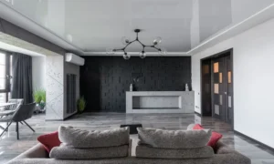
Matte or Eggshell? The Trade-Off Nobody Mentions
Matte is what makes dark colors look rich instead of plastic — it absorbs light rather than bouncing it, which is exactly why it suits navy, charcoal, and forest green. But matte also shows fingerprints, scuffs, and cleaning marks faster than any other finish, and it’s genuinely harder to wipe down without leaving a shiny patch behind.
In a living room that gets heavy daily use — kids, pets, a couch pushed against the wall — that trade-off matters. Eggshell or satin sacrifices a little of the velvety look for a wall you can actually clean. If you want the dark, matte look specifically on a wall that takes a beating, ask about a “scuff-resistant” or “washable matte” line — several major brands now make one, and it closes most of the gap.
How to Choose Your Color Without Wasting Money
- Buy real paint samples, not paper cards. Paper swatches are dyed; liquid samples use actual pigment. Paint a large square on foam board and move it around the room over a full day.
- Check your room’s light direction first. North-facing rooms get cool, bluish light that makes grays look harsh — lean warm to compensate. South-facing rooms get golden light and can handle almost anything, including cooler tones. The Benjamin Moore Color Overview is a genuinely useful reference for how specific pigments shift under different light.
- Match your largest piece of furniture, not the other way around. Paint is cheap and reversible; a sofa is neither. Pull the undertone from your couch or rug and let the wall color follow it.
- Look up the Light Reflectance Value (LRV). Every paint color has an LRV from 0 to 100 — higher reflects more light, lower absorbs it for a moodier result. Most brands list this on the color’s product page, and it’s a far more reliable predictor than judging from a swatch under store lighting.
Mistakes Worth Avoiding
- Choosing a bright, cool white for a room with limited natural light — it reads dingy rather than crisp once the sun isn’t hitting it directly.
- Leaving the ceiling standard ceiling-white while the walls go dark or warm. That contrast creates a hard line that visually lowers the ceiling instead of raising it.
- Picking a high-gloss finish on walls that aren’t freshly skim-coated — gloss reflects every bump and seam. Eggshell, satin, or matte hides far more.
- Choosing paint under fluorescent hardware-store lighting. A color that reads perfectly beige there can turn pink or green once it’s on your own walls in daylight.
Frequently Asked Questions
What paint color makes a small living room feel bigger — dark or light?
Both can work, but for different reasons. Light, warm neutrals reflect available light and keep a small room feeling open and airy. Dark, saturated colors applied to all four walls remove the visual “edges” of the room, which can make it feel larger in a different way. The wrong move is a cool, flat white that does neither.
Should I use matte or eggshell paint in a living room?
Eggshell suits most light to medium walls — it reflects a little light and wipes clean easily. Matte suits dark, saturated colors, since it gives them depth instead of a plastic sheen, but it marks and scuffs faster. In a high-traffic living room, that’s worth weighing against how the color looks.
What is the best accent wall color for a living room?
A deep, saturated shade — hunter green, navy, terracotta — that shares an undertone with the room’s main neutral, so the transition feels deliberate rather than jarring. If your living room already runs dark or gets little natural light, our guide to making a dark living room feel bright goes deeper into balancing bold color against the light you actually have.
How do I choose a color that works with my existing furniture?
Start with the dominant undertone in your largest piece — sofa or rug. Warm, yellow-based furniture pairs with cream or greige walls. Cool-toned furniture, like a blue-gray sectional, pairs better with a crisp, cooler wall color rather than fighting it.
How much does it cost to paint a living room yourself?
Typically $100 to $250 for paint, brushes, rollers, and drop cloths. A standard 12×15-foot room usually needs two gallons for two coats. Higher-quality paint often needs fewer coats, which can offset some of the higher price per gallon.
Does a dark ceiling make a living room look smaller?
Not if the walls match it — that combination (color drenching) blurs the line where wall meets ceiling and reads as continuous space. A dark ceiling against stark white walls does the opposite: it creates a hard line that visually lowers the room.
Final Thoughts
The instinct to play it safe with a pale neutral makes sense, but it isn’t always the choice that makes a small living room feel bigger. Sometimes the answer is a warm greige that reflects what light you have. Sometimes it’s a navy or terracotta wall that removes the room’s edges entirely. Test large swatches, check them across a full day of light, and let your biggest piece of furniture — not the trend list — make the final call.
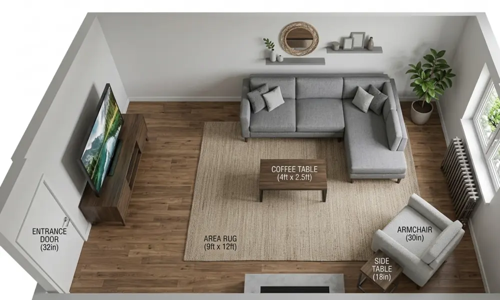
Once the walls are settled, our guide to small living room decor ideas on a budget covers the textiles and layering that build on top of whichever color you choose. And if furniture placement is still an open question, see our small living room layout guide for proportions and walkway clearances.