
I have seen countless living rooms fall flat simply because the homeowner chose a bright, stark white paint, assuming it would instantly brighten a small, north-facing space. In reality, the most expensive-looking rooms rely on subtle undertones rather than price tags to create depth and warmth.
Choosing the right living room color ideas on a budget means understanding how light interacts with specific pigments, not just blindly following trends.
This guide breaks down exact color combinations, the actual finishes you need, and a foolproof process for selecting paint so you get a high-end look without paying designer fees.
What Colors Make a Living Room Look Bigger and More Expensive? (Quick Answer)
Warm off-whites, creamy greiges, and deep moody tones are the best colors to make a living room look bigger and more expensive on a budget. Warm neutrals like Benjamin Moore’s Swiss Coffee bounce light around the room, creating an airy, high-end feel.
Conversely, deep tones like dark navy or forest green blur the edges of a room, creating an illusion of depth and grandness. Matte finishes on dark colors and eggshell on light colors enhance this luxurious aesthetic.
Key Takeaways
-
Always use an eggshell finish for light living room walls to gently reflect natural light, and a matte or flat finish for dark colors to absorb light and create velvety depth.
-
Limit bold accent walls to architectural features like fireplaces or alcoves; painting one random wall a bright color disrupts the room’s flow and cheapens the aesthetic.
-
Test paint swatches on all four walls and observe them in morning, afternoon, and evening artificial light before buying gallons.
-
Warm undertones (yellow, pink, or beige) make a space feel rich and inviting, whereas cool undertones (blue or stark gray) can make a room feel sterile or institutional.
-
Painting the ceiling, baseboards, and walls the exact same shade creates a continuous, custom look that visually raises the ceiling height.
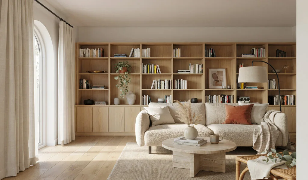
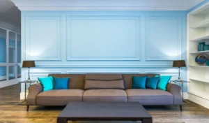
Warm White Walls: The Foolproof Base That Makes Everything Look More Expensive
Warm white paint instantly updates a dated room, providing a clean canvas that makes budget furniture look intentional and styled. You want to look for a white with a subtle yellow or beige undertone to prevent the space from feeling like a hospital waiting room. This color thrives in almost any lighting condition, but it truly glows in south-facing rooms that get plenty of direct sunlight. Pair it with an eggshell finish to keep the walls wipeable and subtly reflective. Consider a specific shade like Sherwin-Williams Alabaster, which holds just enough creaminess to feel luxurious.
Designer Tip: Paint your trim and baseboards the exact same warm white as the walls, but in a satin finish, to create a subtle textural contrast that feels highly custom.
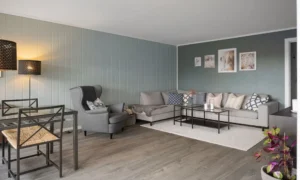
Greige and Cream: The Neutral Middle Ground With High-End Appeal
Greige strikes the perfect balance between the warmth of beige and the modern edge of gray. This shade provides grounding depth in living rooms that lack interesting architectural details. It pairs exceptionally well with natural wood tones, brass hardware, and textured fabrics like linen. A classic choice is Benjamin Moore’s Revere Pewter, which acts as a chameleon, leaning warmer in artificial light and cooler in natural daylight.
Designer Tip: Layer different shades of greige and cream throughout your textiles—curtains, rugs, and throw pillows—to build a monochromatic look that screams luxury without requiring expensive individual pieces.
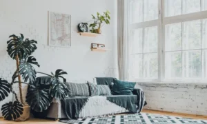
Muted Sage Green: Bringing the Outdoors Inside for a Grounded Feel
Sage green acts as a neutral when paired with the right earthy elements, adding color without overwhelming a small space. Look for a green with a heavy gray undertone to keep the room feeling sophisticated rather than looking like a child’s playroom. This shade excels in rooms with wood floors or leather furniture, pulling out the natural warmth of those materials. A flat or matte finish works best here to emphasize the organic, velvety nature of the color.
Designer Tip: Avoid bright white ceilings with sage walls; instead, use a cream or pale beige on the ceiling to soften the transition and keep the room feeling cohesive.
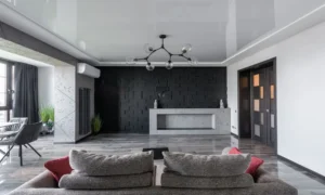
Deep Navy Blue: Blurring the Lines to Make a Small Room Feel Massive
Many people think dark colors shrink a room, but deep navy actually forces the walls to recede visually, making the space feel expansive. This moody tone requires a matte finish to prevent harsh light reflections that highlight drywall imperfections.
Navy works best in rooms that already receive minimal natural light, leaning into a cozy, library-like atmosphere. A rich shade like Farrow & Ball’s Hague Blue offers a complex, deep pigment that changes beautifully from day to night.
Designer Tip: If you commit to dark navy walls, keep your area rug and seating light—think cream, light camel, or pale gray—to prevent the room from feeling like a cave.
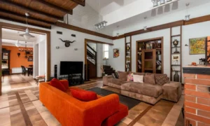
Baked Terracotta: Adding Instant Warmth and Character
Terracotta injects immediate character into bland, boxy living rooms, giving them a sun-baked, Mediterranean quality. You need a shade that heavily relies on brown and dusty orange undertones rather than bright red. This color looks stunning against crisp white trim and organic materials like rattan, jute, and linen. It is highly effective in north-facing rooms where the natural light tends to be cool and bluish, as the warm pigment counteracts the chill.
Designer Tip: Terracotta walls pair perfectly with rich, dark green plants; the contrasting colors make both the paint and the foliage pop, instantly upgrading the room’s visual value.
Soft Warm Gray: The Sophisticated Backdrop for Modern Decor
Unlike stark, cool grays that can leave a room feeling icy, a warm gray brings a soft, tailored elegance. You want a gray with brown or taupe undertones to keep the atmosphere inviting. This color works beautifully in south-facing rooms and pairs well with sleek, modern furniture or metallic accents. It provides just enough contrast against pure white ceilings and trim to look deliberate and architectural.
Designer Tip: Use matte black hardware on doors, lamps, and curtain rods against warm gray walls to create a crisp, expensive-looking contrast.
Faux Limewash: Adding Plaster Texture Without the High Price Tag
Textured walls are a staple in high-end design, and you can mimic a pricey Venetian plaster look using standard paint and a block brush. By applying a base coat and then sweeping a slightly lighter shade over it in a criss-cross pattern, you create shadows and depth. This technique hides wall imperfections beautifully and gives the room an earthy, old-world charm. Stick to earthy tones like beige, soft clay, or pale olive for the most realistic plaster effect.
Designer Tip: Mix a small amount of drywall joint compound into your topcoat of paint to give the walls actual, tactile texture before sealing it with a matte clear coat.
The Intentional Accent Wall: Strategic Color Placement
When done correctly, a single dark or bold wall anchors a room and draws the eye to a specific focal point. You should only place an accent color on a wall that naturally commands attention, such as the wall behind a fireplace or a custom built-in bookshelf. Using a deep charcoal or forest green creates instant drama for the cost of just one quart of paint. Leave the remaining walls a soft, warm white to keep the overall space bright.
Designer Tip: Never paint a wall with a window or the main entry door as your accent wall; the backlighting will make the color look muddy, and it disrupts the visual balance of the room.
Dusty Blush Pink: A Surprisingly Neutral and Elegant Option
Blush pink has shed its childish reputation and emerged as a highly sophisticated neutral for adult spaces. You must choose a shade with heavy brown or gray undertones—often labeled as “plaster” or “setting sun”—to keep it grounded. This subtle tone wraps a room in warmth and casts a highly flattering light, making it a great backdrop for entertaining. It works exceptionally well with brass accents and dark, contrasting furniture like a charcoal velvet sofa.
Designer Tip: Treat dusty blush exactly as you would beige; do not over-accessorize with other pastel colors, or the room will quickly look like a nursery rather than a chic lounge.
How to Choose the Right Living Room Color on a Budget (Without Making a Costly Mistake)
-
Buy real paint samples, not just paper cards. Paper swatches are dyed, while liquid samples contain real paint pigments. Paint a large square on a piece of foam board and move it around the room throughout the day.
-
Analyze your room’s natural light direction. North-facing rooms receive cool, bluish light that makes grays look harsh; combat this with warm undertones. South-facing rooms get warm, golden light and can handle almost any color, including cooler shades. Checking resources like the Benjamin Moore Color Handbook helps clarify these lighting interactions.
-
Anchor your color choice to your largest piece of furniture. Paint is cheap and comes in thousands of shades; a sofa is expensive and hard to replace. Always match the paint undertone to your couch, rug, or flooring. Finding small living room decor ideas on a budget that still look luxurious becomes much easier when your wall color naturally supports your existing major pieces.
-
Check the Light Reflectance Value (LRV). Every paint color has an LRV rating from 0 to 100. A high LRV (closer to 100) reflects more light, keeping small rooms bright, while a low LRV absorbs light for a moodier feel. Use this metric to accurately predict how dark a color will actually look on your walls.
Common Living Room Color Mistakes to Avoid
-
Choosing a bright, cool white for a low-light room. Stark whites need abundant natural light to look crisp. In a dark room, they look dingy, gray, and cheap. Use a heavily pigmented cream or beige instead.
-
Ignoring the ceiling. Painting the ceiling standard ceiling white creates a harsh visual line that abruptly stops the eye, making the ceiling feel lower. Bring the wall color up onto the ceiling, or use a shade just 20% lighter, to create a tall, continuous visual flow.
-
Using a high-gloss finish on imperfect walls. Glossy finishes reflect every single bump, dent, and drywall seam. Unless you have brand-new, perfectly skim-coated walls, stick to eggshell, satin, or matte to hide flaws.
-
Picking paint under store fluorescent lighting. The harsh lighting in big-box hardware stores completely distorts color. A color that looks perfectly beige in the store will often turn pink or green in your home’s natural light.
Frequently Asked Questions
What is the best paint color for a small living room on a budget?
The best paint color for a small living room on a budget is a warm, creamy off-white or a light greige. These shades maximize the reflection of natural light, tricking the eye into perceiving the walls as further away than they are. They also serve as a versatile backdrop, allowing you to update throw pillows and cheap decor over time without having to repaint.
What colors make a living room look more expensive?
Deep, complex colors like charcoal, navy blue, and forest green make a living room look incredibly expensive and custom. Alternatively, rich, warm neutrals with beige or taupe undertones project a quiet luxury aesthetic. Staying away from highly saturated primary colors (like bright red or standard blue) keeps the space feeling sophisticated and high-end.
Should I use matte or eggshell paint in a living room?
You should use an eggshell finish for most light to medium-toned living room walls because it offers a slight sheen that reflects light and is easy to wipe clean. However, if you are painting the room a very dark color, use a matte or flat finish. Matte prevents dark colors from looking plastic and instead gives them a rich, velvety depth that hides drywall flaws.
What is the best accent wall color for a living room?
The best accent wall color for a living room is a deep, saturated shade like hunter green, navy, or terracotta that creates deliberate contrast. You must ensure the chosen accent color shares an undertone with the main neutral wall color so the transition feels intentional rather than jarring. Never use a bright, aggressive color like neon yellow or cherry red, as these disrupt the room’s relaxing atmosphere.
How do I choose a living room color that works with my existing furniture?
Look closely at the dominant undertone in your largest piece of furniture, such as your sofa or rug. If your couch has warm, yellow-based threads, choose a warm paint color like cream or greige to complement it. If your furniture is cool-toned, like a blue-gray sectional, opt for a cool, crisp wall color to prevent the items from clashing with the paint.
How much does it cost to paint a living room yourself?
Painting a living room yourself typically costs between $100 and $250 for the paint, brushes, rollers, and drop cloths. A standard 12×15 foot living room usually requires two gallons of paint for two coats. Investing in high-quality paint, such as those from Sherwin-Williams, often saves money in the long run because it requires fewer coats to achieve full coverage.
Do dark ceilings make a living room look smaller?
Contrary to popular belief, a dark ceiling does not inherently make a room look smaller, provided the walls are painted the same dark color. This technique, called color drenching, blurs the hard lines where the wall meets the ceiling, giving the illusion of endless space. However, a dark ceiling with stark white walls will visually lower the ceiling height, creating a compressed, heavy feeling.
Final Thoughts
Your living room paint color is the foundation of your entire design scheme, setting the tone for how the space feels every time you walk in. Take the time to paint large test patches and watch how the shadows stretch across them at different times of the day. Start by evaluating the largest, most expensive piece of furniture you own, and pull a coordinating undertone from that fabric to ensure a perfectly cohesive, expensive-looking result.