
A small bedroom can feel calm, bright, and easy to live in. It can also feel tight the moment someone walks in. In most cases, the problem isn’t the square footage alone. It’s the layout.
These small bedroom layout mistakes tend to visually shrink a room, block movement, and make storage harder than it needs to be. The good news is that most of them are fixable without remodeling. A better plan for bed placement, furniture scale, light, and storage can change the whole mood of the room.
Bed placement mistakes that throw off the whole room
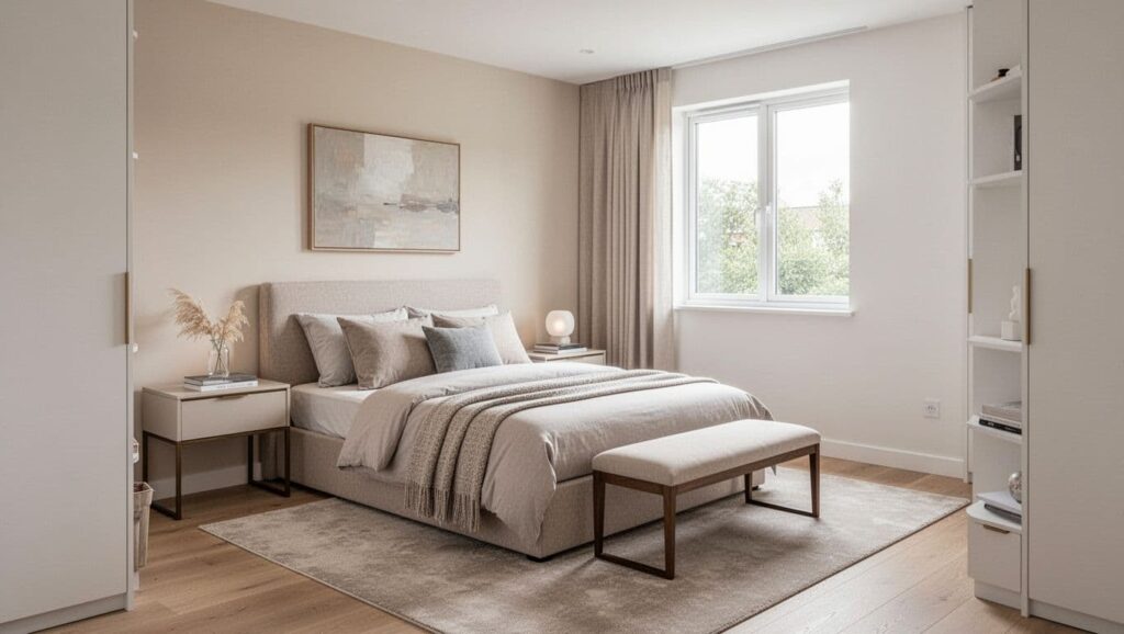
The bed is the largest item in most bedrooms. Because of that, its position shapes walking space, balance, and how open the room feels at first glance.
1. Placing the bed where it blocks the easiest path through the room
A bed in the main walkway makes a room feel cramped before anything else does. If the door opens and the first move is a sidestep around the mattress, the layout already feels wrong.
Designers usually clear the path from the door first. Then they place the bed on the strongest wall, often the longest uninterrupted wall, or the least disruptive wall in an awkward room. The aim is simple: get from the door to the bed, window, and closet without weaving around furniture.
In a small bedroom, open floor matters as much as floor area.
2. Choosing a bed that’s too large for the room
An oversized bed can swallow a small room whole. It steals the space needed for nightstands, walking room, and visual balance. The result is a bedroom that feels packed, even when it isn’t cluttered.
A better fix is to choose the largest bed that still lets the room breathe. In many compact rooms, that means a queen instead of a king, or a slimmer frame around the same mattress size. Guidance from Real Simple on styling a small bedroom around a large bed reflects the same idea: when the bed dominates, every other piece has to work harder and smarter.
3. Using a bulky bed frame, tall headboard, or footboard
Heavy bed frames crowd a room visually, even before storage baskets or extra pillows show up. Tall headboards, thick side rails, and footboards can make the center of the room feel blocked.
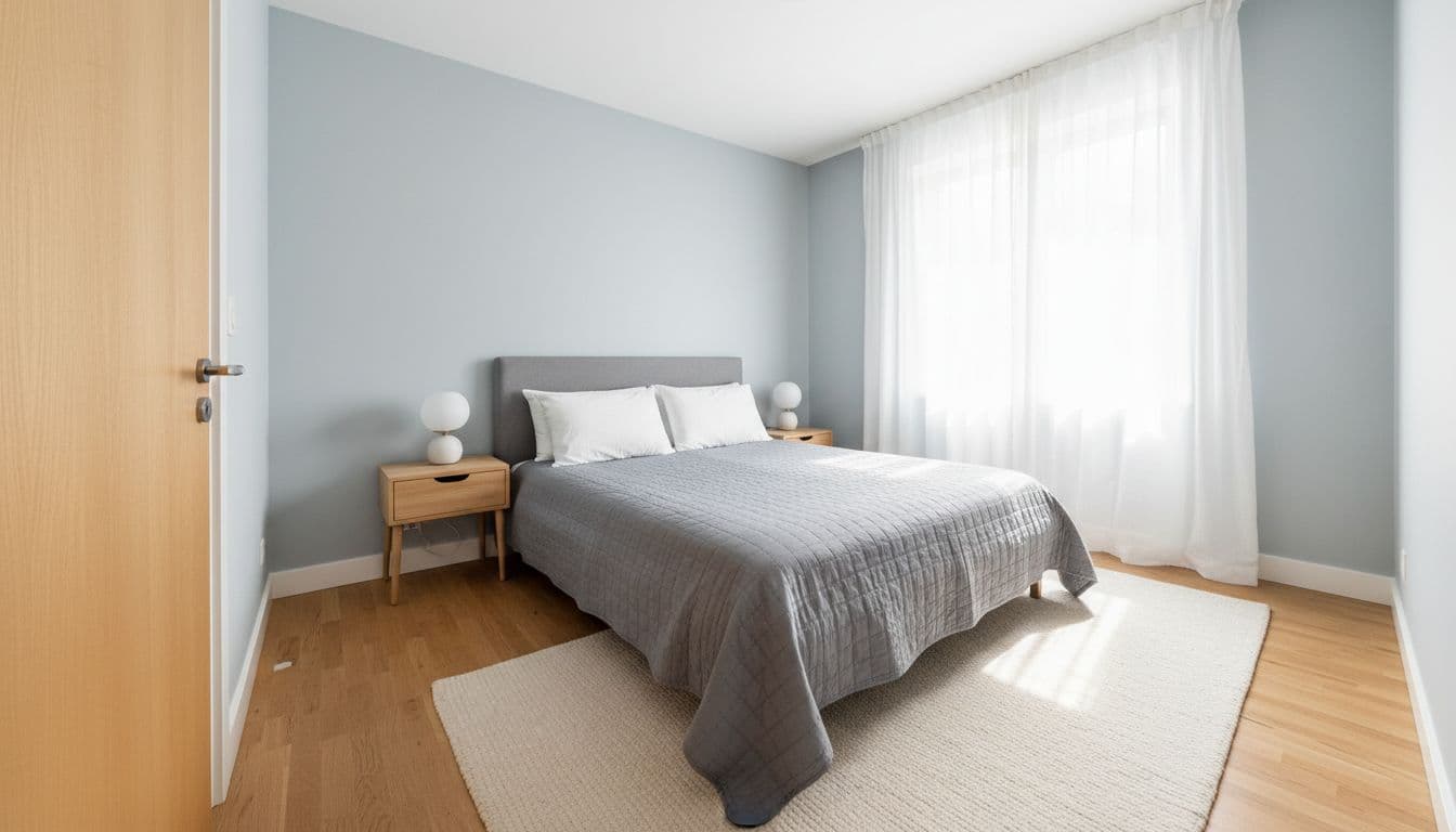
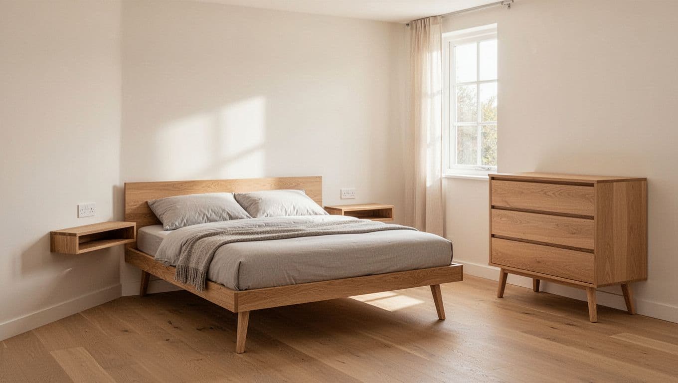
That’s why designers often switch to low-profile platform beds, simple frames, or styles without footboards. Lower silhouettes make ceilings seem higher, and lighter shapes reduce visual weight. That lines up with 2026 bedroom trends as well, since lighter, lower bed forms and vertical details are being used to make compact rooms feel calmer and taller.
For a broader expert view, Homes & Gardens’ take on small bedroom layout mistakes also points to bed position and proportion as frequent trouble spots.
Furniture choices that quietly eat up space
Small bedrooms often feel smaller because the pieces around the bed are too deep, too dark, or simply too many. Good layout is partly about fit, but it’s also about editing.
4. Pushing every piece of furniture flat against the walls
This sounds smart, but it often backfires. In narrow rooms, wall-to-wall placement can create a strange empty center while walkways still feel awkward near the bed or closet.
Designers don’t float furniture just for style. They move pieces with purpose. Sometimes shifting the bed a few inches, or pulling a nightstand into better alignment, improves the room more than adding storage ever could. Balanced placement usually feels better than rigid placement.
5. Using nightstands that are too wide, too deep, or mismatched in scale
Chunky bedside tables pinch the bed and steal walking room. In a compact bedroom, even a few extra inches on each side can make the layout feel tense.
The fix is usually a slimmer nightstand, a floating shelf, or a wall-mounted ledge. Height matters too. The best bedside surface sits close to the top of the mattress, so it looks aligned and feels easy to use. That small detail creates visual order, which helps a room feel larger.
6. Keeping too many pieces, especially dark or visually heavy ones
A bench at the foot of the bed, an accent chair, a chest, a vanity, and a small cabinet can add up fast. Even worse, very dark or ornate pieces absorb light and feel heavier in a tight room.
Designers usually cut back to the essentials, then choose furniture that works harder. A dresser might double as a vanity. A storage bed can replace an extra chest. Open-leg pieces, lighter wood tones, and painted finishes let more light move through the room. Real Simple’s article on bedroom design mistakes echoes that same point: visual weight matters almost as much as actual size.
Light, storage, and visual flow problems that make a bedroom feel boxed in
Some of the most common layout issues aren’t about the bed at all. They’re about how light moves, where the eye lands, and whether the floor stays clear.
7. Blocking windows or making natural light work too hard
A tall dresser near the window, a badly placed bed, or heavy curtains can dim a small bedroom in a hurry. Once the strongest light source gets blocked, the room feels flatter and more closed.
The fix is straightforward. Keep the window zone as open as possible, use airy curtains, and place larger pieces away from the main light source when the layout allows it. Even in rentals, swapping dense drapes for sheers can change the room’s scale.
8. Relying on one weak ceiling light
One overhead bulb rarely does enough. It throws shadows into corners and makes the room feel smaller at night.
Designers build layers instead. A pair of bedside lamps, wall sconces, pendants, or one small accent light can brighten the room at different heights. That matters because better lighting improves both function and the sense of space. Homes & Gardens’ guide to bedroom layout mistakes also highlights poor lighting as a common reason bedrooms feel off.
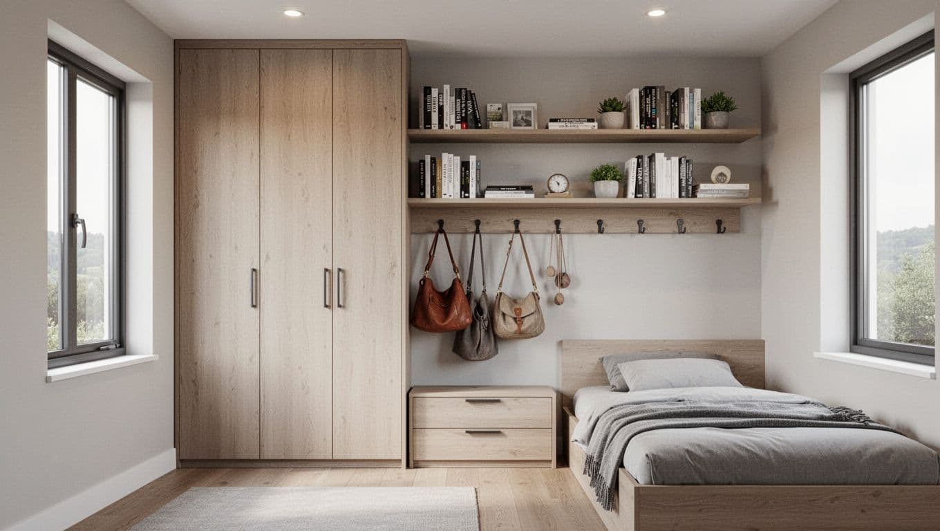
9. Ignoring vertical storage and leaving everything at floor level
Floor-level clutter shrinks a room fast. Laundry baskets, extra bins, and low storage pieces spread outward, so the eye reads the room as crowded.
Instead, designers use the wall. Tall wardrobes, high shelves, hooks, and narrow vertical storage free up floor space and pull the eye upward. That move is especially useful in rentals, guest rooms, and compact apartments where built-ins aren’t an option.
10. Skipping mirrors, or using the wrong rug size
Without a mirror, a small room can feel visually closed. There’s nothing to bounce light or extend the view. A well-placed mirror near a window, or across from a light source, helps the room feel deeper without adding bulk.
Rugs matter too. A rug that’s too small makes the room feel disconnected, almost like the furniture is floating on little islands. Designers usually choose a rug that extends beyond the sides of the bed, or use runners when a full rug won’t fit. Both choices make the layout feel grounded and more complete.
Clutter and poor zoning mistakes that make even a decent layout feel cramped
Even a smart furniture plan can fail if storage spills into sight and the room has no clear purpose. This last mistake is often the one that makes a bedroom feel busy, even when the room size is reasonable.
11. Letting storage overflow into every corner, with no clear focal point
Open baskets, laundry piles, stacked bins, and half-used surfaces turn free space into visual noise. At the same time, random placement makes the eye jump from one thing to the next, so the room feels smaller and less restful.
The designer fix is not perfection. It’s restraint and clearer zoning. Closed storage hides the busy parts. Under-bed storage works well when it’s neat and limited. Each item category should have one home, not three. Then the room needs one clear focal point, usually the bed wall, with simple zones for sleeping, dressing, and, if space allows, a very small reading or work spot.
This is also where fewer pieces often look more luxurious than a full set. Livingetc’s look at common bedroom layout errors makes a similar case: a bedroom reads better when the layout feels intentional, not filled to capacity.
A smaller room can still feel generous
Most small bedroom layout mistakes are fixable without knocking down walls. Better bed placement, right-sized furniture, layered light, and less visible clutter can make a room feel larger fast.
The best layouts support comfort, light, and easy movement. A bigger bedroom isn’t always the answer. Often, a calmer plan is.